Content
Introduction
Due to the new (Figure 1) definition of the standard tabbed dialogue there is a need to define some visual guidelines for successfully complete layout.
The units which are used in this guideline are Map AppFont (ma) and Pixel (px). Map AppFont units are device and resolution independent. One Map AppFont unit is equal to one-eighth of the average character (System font) height and a quart in width.
In the first draft, the dimension are only in pixels the will be replaced in the next version. The screen samples
were made on a system with a resolution of 1280 x 1024 at 96 dpi.
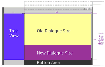
Figure 1 Shows the new size for a tabbed dialogue.
Layout
One of the most critical area in visual design is to create a visually consistence
in spacing, size, alignment etc. From the structural side (for western countries)
the information should be provided as follows:
The most important information should be located in the upper left area.
After this content follows from left to right and top to the bottom.
Size
The following table lists the typical dimensions of common control which are used in StarOffice.
| Control | Height | Width |
| Command Buttons | 14 | 50 |
| Check Boxes | 10 | As wide as needed |
| Radio Buttons | 10 | As wide as needed |
| Drop down, combo and drop down list boxes | 12 | Size match other drop downs etc. |
| Text boxes | 12 | As wide as needed |
| Text labels | 8 | As wide as needed |
| Other text | 8 | As wide as needed |
Spacing and Positioning
Alignment is very important for a good dialogue design. Try to create a consistent and clear layout. Use the dialogue spaces shown in figure 2 and 3.
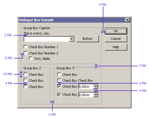
Figure 2 Map Appfont spaces between dialogue items.
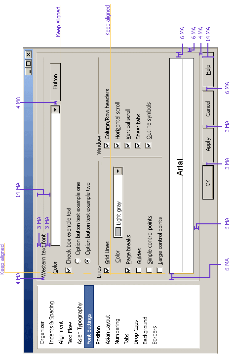
Figure 3 Map Appfont spaces between dialogue items.
The following table list the recommended spacing between common dialogue items.
| Dialogue item | Space between (MA) |
| Dialogue Box Margins (Vertical) | 6 |
| Dialogue Box Margins (Horizontal) | 3 |
| Fixed line Margins Vertical | 6 |
| Between text paragraphs | 7 |
| Between text label and their control for (example text beneath a list box) | 3 |
| Between related controls | 4 |
| Between unrelated controls | 7 |
| First control in a group box or under a fixed line | 3 |
| Between controls in a group box | 4 If a group box is used align vertical to the group box title |
| From the left edge to a group box / fixed line | 6 |
| From the left edge to a preview | 6 |
| Content: From the right edge of a group box / fixed line | 6 |
| Content: From the top edge of a group box / fixed line | 3/6 |
| Content: Above the bottom edge of a group box | 6 |
| Text | 8 |
Translation
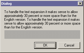
Translations from English to other languages can affect the size of the dialogue for example: